
Sparcle
Experience Secure Messaging, Effortless File Sharing, and Crystal-clear Voice & Video Calls—all with cutting-edge P2P Technology.
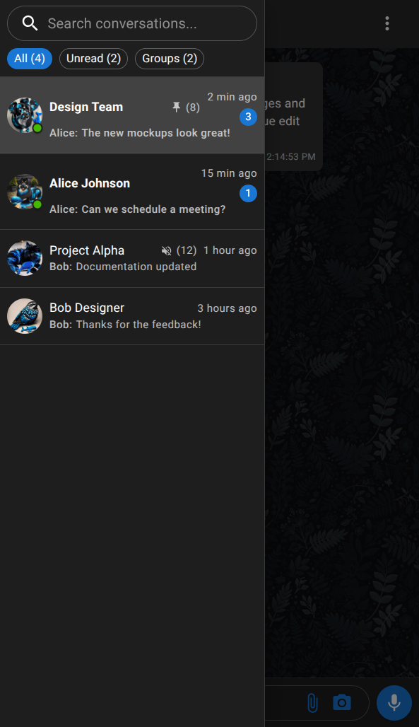
Decentralized P2P encrypted messaging - No setup required
Scroll to explore
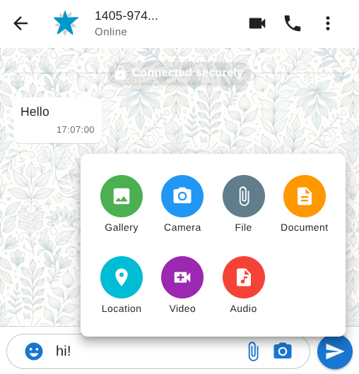
Text, voice, photos, videos, and more — end-to-end encrypted between you and your peers.
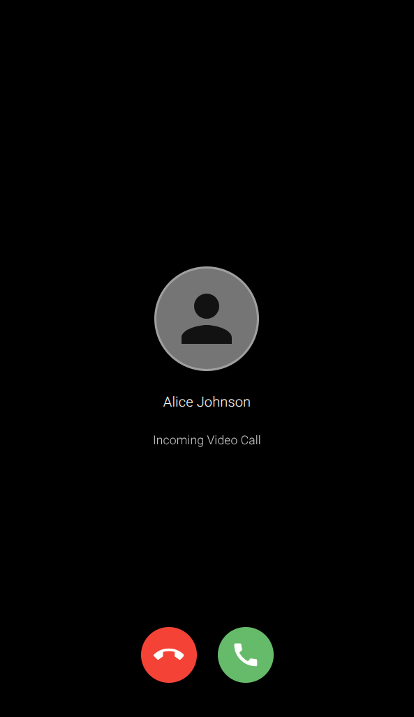
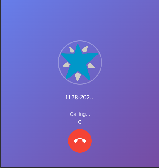
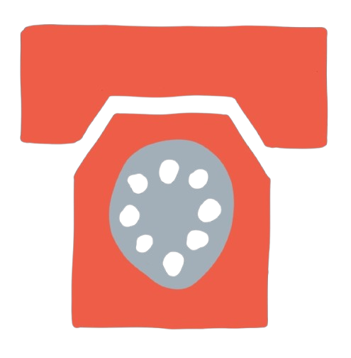
Crystal-clear voice and video between connected peers. Secure P2P calling with no central server in the middle.
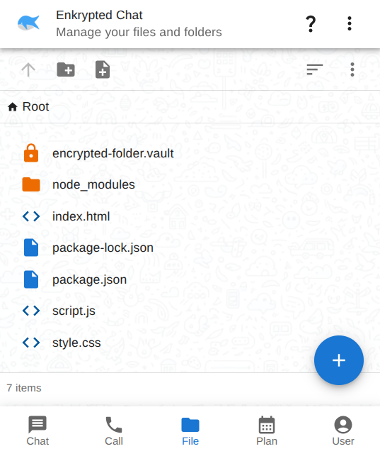
Encrypted local storage for your files — manage and share documents securely in the browser, with everything kept on your device.
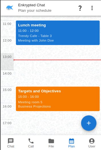
A local-first calendar for your schedule. Your plans stay on your device — no account or cloud sync required.

Advanced end-to-end encryption keeps your conversations secure. Only you and your peer can send and receive messages or have calls.
Using ML-KEM (Kyber) for a post-quantum resistant key encapsulation mechanism.
The Signal Protocol in Rust that compiles to WASM for browser-based usage.
Use Enkrypted Chat without any real setup, so focus on the moments you want to share.
Innovating is a big part of what we do. We are always looking for new ways to improve the technology, user experience and the security of our products.
Experience Secure Messaging, Effortless File Sharing, and Crystal-clear Voice & Video Calls—all with cutting-edge P2P Technology.
Using P2P E2EE file transfer, you have total privacy, seamless sharing. Connect Across all platforms. State-of-the-art encryption and universal file transfer.
Secure peer-to-peer video calls with end-to-end encryption. Connect directly with other users without routing through central servers.
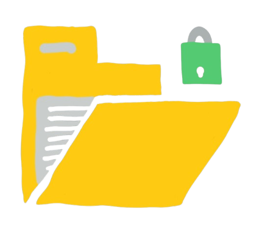
Browser-based file vault with robust encryption, on device storage. Bridging security and convenience for your sensitive data.

Experience Secure Messaging, Effortless File Sharing, and Crystal-clear Voice & Video Calls—all with cutting-edge P2P Technology.

The Signal Protocol in rust that compiles to WASM for browser-based usage.

A modern UI framework that leverages functional components with a React-like hooks system. It features efficient, event-driven state management using custom hooks for state, effect, memoization, styling, and scoping, while providing secure, encrypted IndexedDB storage and supporting both component scoping and scalable module federation.
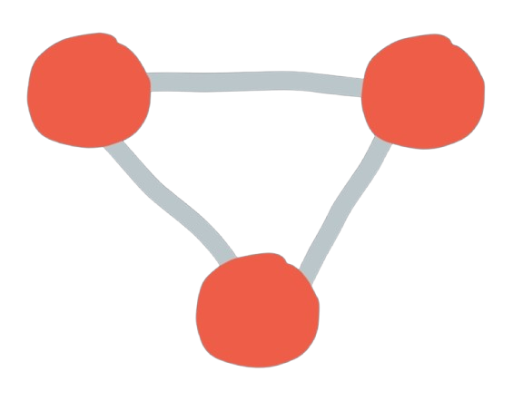
Our P2P framework empowers you to build decentralized applications efficiently. It abstracts the complexities of WebRTC and network protocols into simple, intuitive APIs, ensuring seamless connectivity across browsers and devices.
Our cryptography utility provides essential encryption tools for developers and security professionals. Implement strong encryption in your applications with battle-tested algorithms.
Stay updated with our latest developments, technical insights, and security best practices. Deep dive into decentralized communication and privacy-focused technology.